

rabbit - case study
Smart restocking for the corner store
marketplace
Project Inputs
UX strategy, Visual/UI design, User research, Competitors analysis, Wireframes & high-fidelity prototypes, usability testing & iterative refinement.
Industry
Retail & E-commerce Solutions, Fintech
B2B Checkout Redesign
The first time I shadowed Don Rubén
Owner of a tiny corner shop with two aisles and zero spare time
I watched checkout turn into a maze: costs appearing late, tiny fields on an old phone, and the same question in his eyes: “Did my order actually go through?”
The brief was clear: increase checkout conversion, cut abandonment below 50%, and shorten time to purchase for a low-digital audience that buys between customers and distributors.
Before designing, I mapped the funnel and framed hypotheses: friction from forms, low trust in payment, surprise fees, and lack of order certainty.
Aligning business goals with user needs
Defining the Problem
When I joined, the app had a solid idea but the execution fell short. Gaps in flow and weak hierarchy made real-world tasks unreliable.
Business goals
• Increase average order size (dropsize)
• Lift checkout conversion
• Reduce time to purchase
• Raise product discovery efficiency
• Lift checkout conversion
• Reduce time to purchase
• Raise product discovery efficiency
user Key Frictions
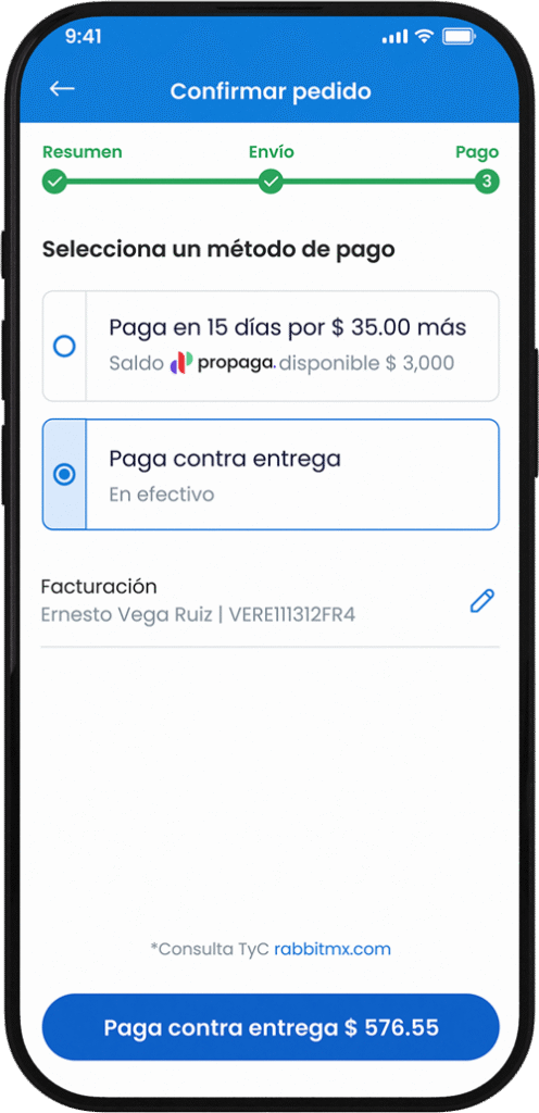
Surprise Fees at the Final Step
Total changes at the end feel like a “gotcha,” so users abandon.
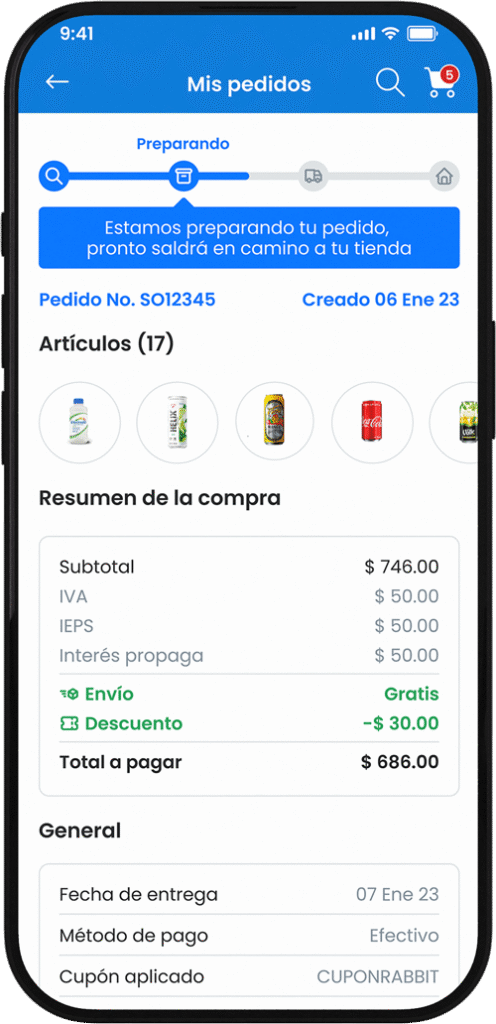
Lack of certainty
No clear progress/confirmation; people aren’t sure it worked and exit.
Surprise Fees at the Final Step
Total changes at the end feel like a “gotcha,” so users abandon.
Lack of certainty
No clear progress/confirmation; people aren’t sure it worked and exit.

Make the next step obvious
Clarity in the journey converts
intent into outcomes
intent into outcomes
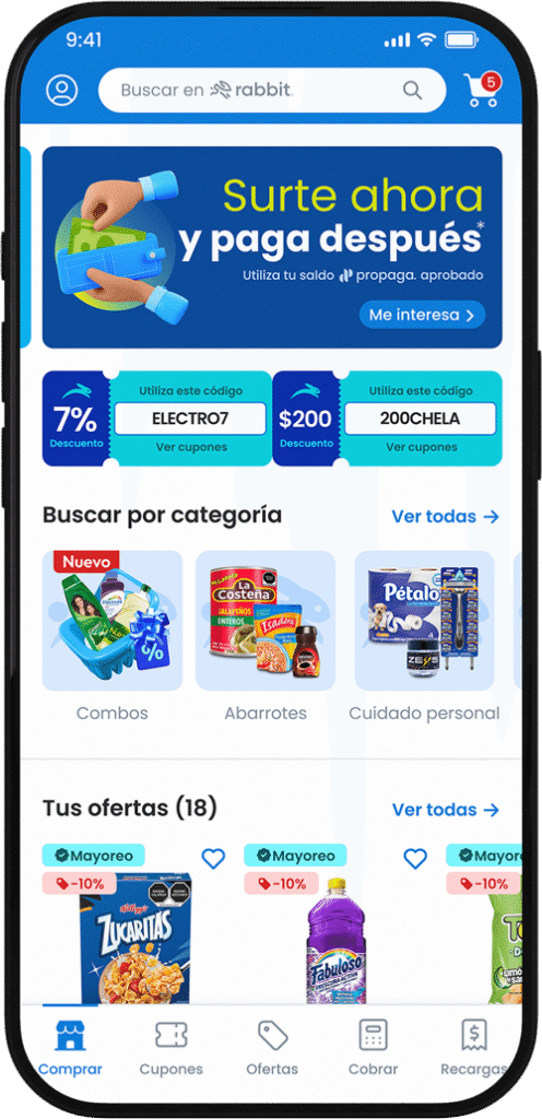
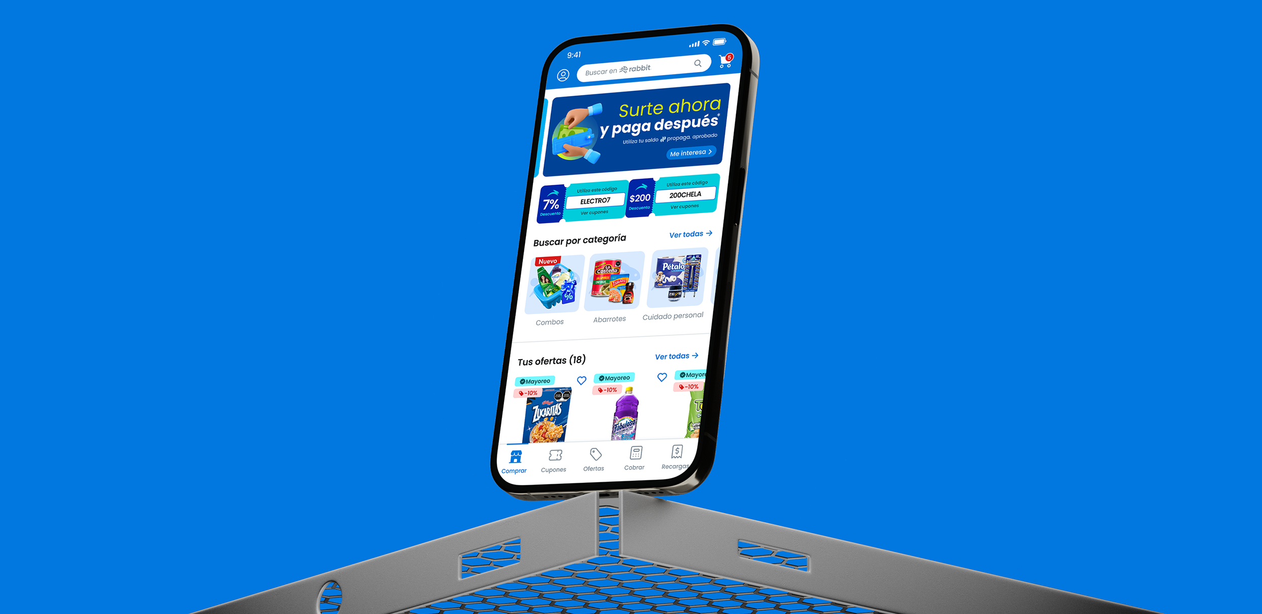
Core Product Features
One-step onboarding (phone first)
Sign up with phone number and minimal fields. Autofill when possible. Less friction, more activations.
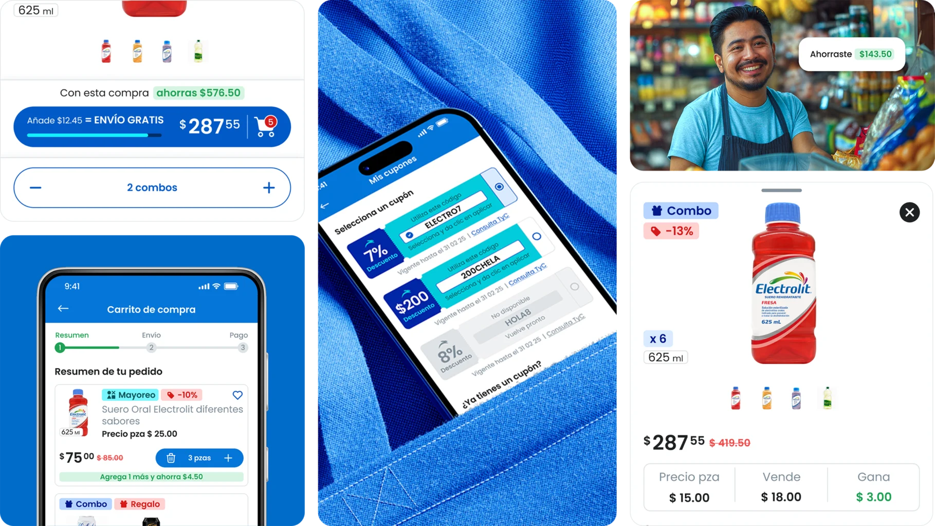
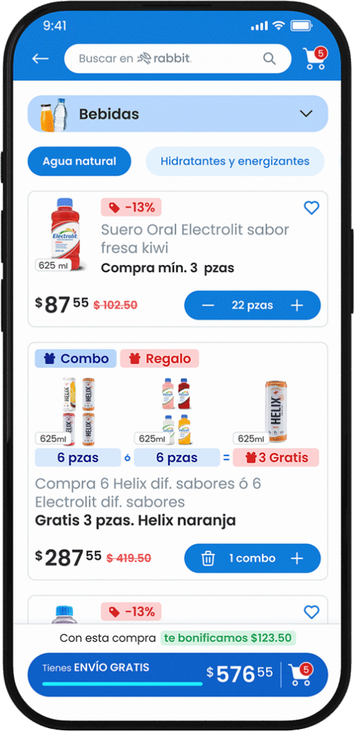
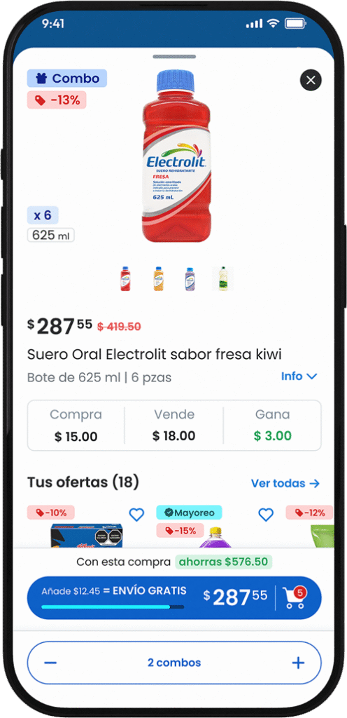
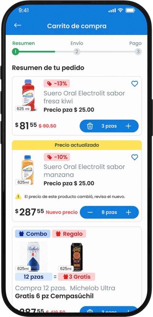
Sticky cart with live total
Persistent banner showing subtotal, shipping/bonuses in real time, and a checkout CTA. Constant transparency reduces abandonment.
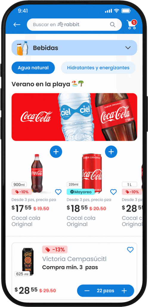
Scalable product card
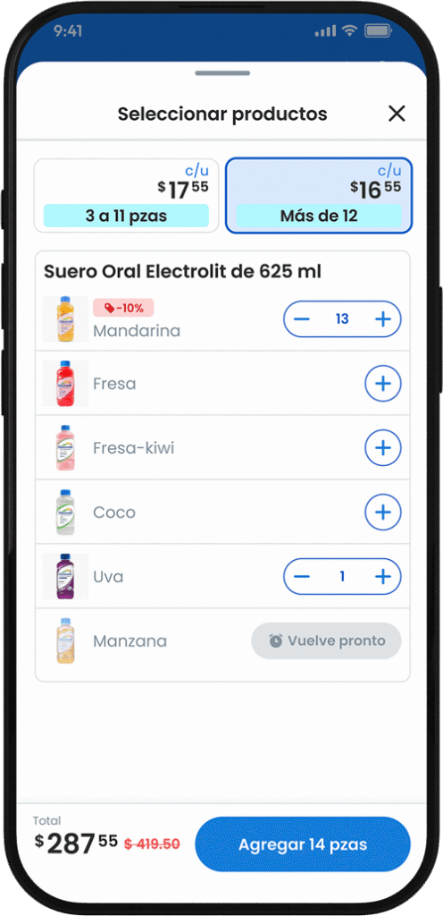
Clear visual hierarchy, key info up front (price, stock, unit/case), promo tags, and visible variants. Faster decisions.
Stepper-guided checkout
Step-by-step flow (review, address, payment), multiple payment methods, and actionable success/error screens. Higher completion and confidence.
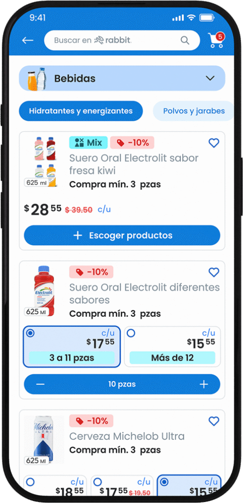
Contextual carousels
Offers and bundles tailored to segment and purchase history. Raises average order value.
Block-based navigation
Structure by category, subcategory, and filters with simple menus and grouped content. Fewer clicks to the right product.
Intelligent search
Typo tolerance, keyword understanding, and similar-result suggestions. Fewer zero-result searches, better discovery.
Cart recovery
On return, restore cart with updated prices, applicable promos, and clear status. Converts previous intent into purchase.
Less doubt, more done
Design that drives action


Marketplace — Key outcomes
• +30% funnel progression from simpler flows and components.
• +50% average order value via simple product cards, presets (1/6/12/case), and combos.
• −10–12 pp drop-off and −28% support tickets after adding progress + receipt + WhatsApp.
• Stronger visual hierarchy: clear title, subtitle, action, contrast, and spacing = fewer errors and faster decisions.
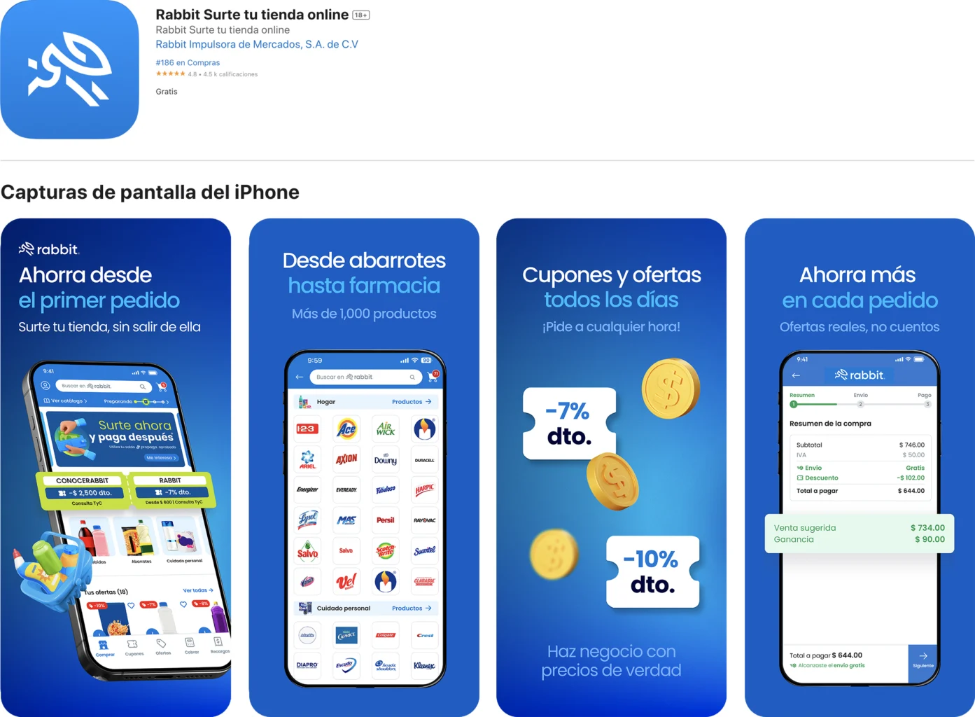
• Usability 85/100 in tests; 4.7★ / 100k+ downloads as a market signal.

retail and Rewards
Your trusted network that turns prices into opportunities
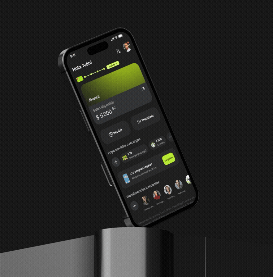
digital account
Your first step to smarter money
financial services
Simple money, same-day answers