

fotofacturas — web
A new visual language for a new way of invoicing
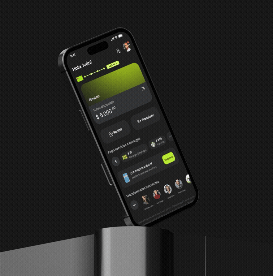
fotofacturas
Project Inputs
Product design, UX UI design, Motion, High-fidelity prototypes, Creative direction, visual design
Industry
Fintech, Smart invoicing, SaaS
Link
GO TO WEBCreative Concept
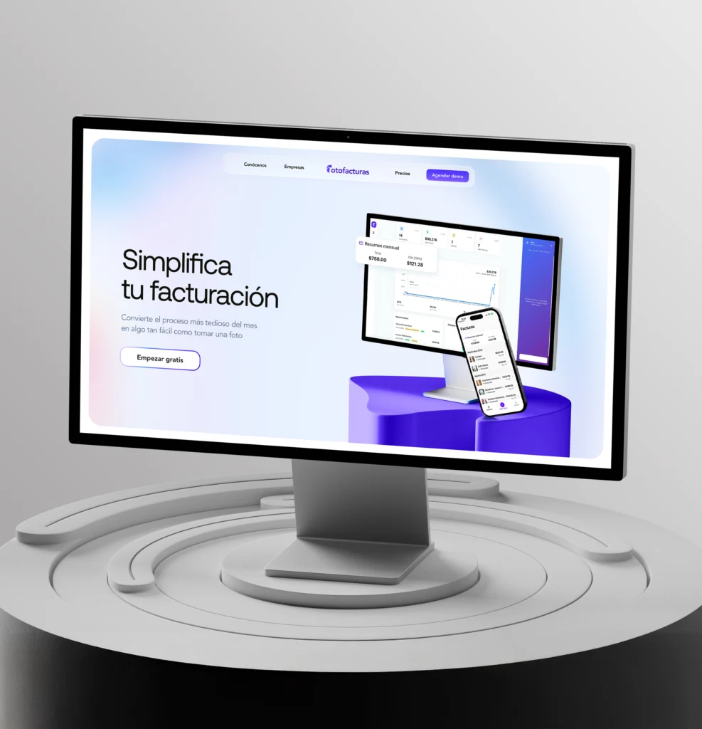
An identity optimized for trust, powered by clarity and interaction
The redesign starts from a simple premise: if invoicing can be simple, the website should be too.
I created a visual language that is clean, accessible, and modern — removing noise and focusing on highlighting the product’s value without distracting the user.

The foundation behind the new experience
The design direction is built on three key pillars
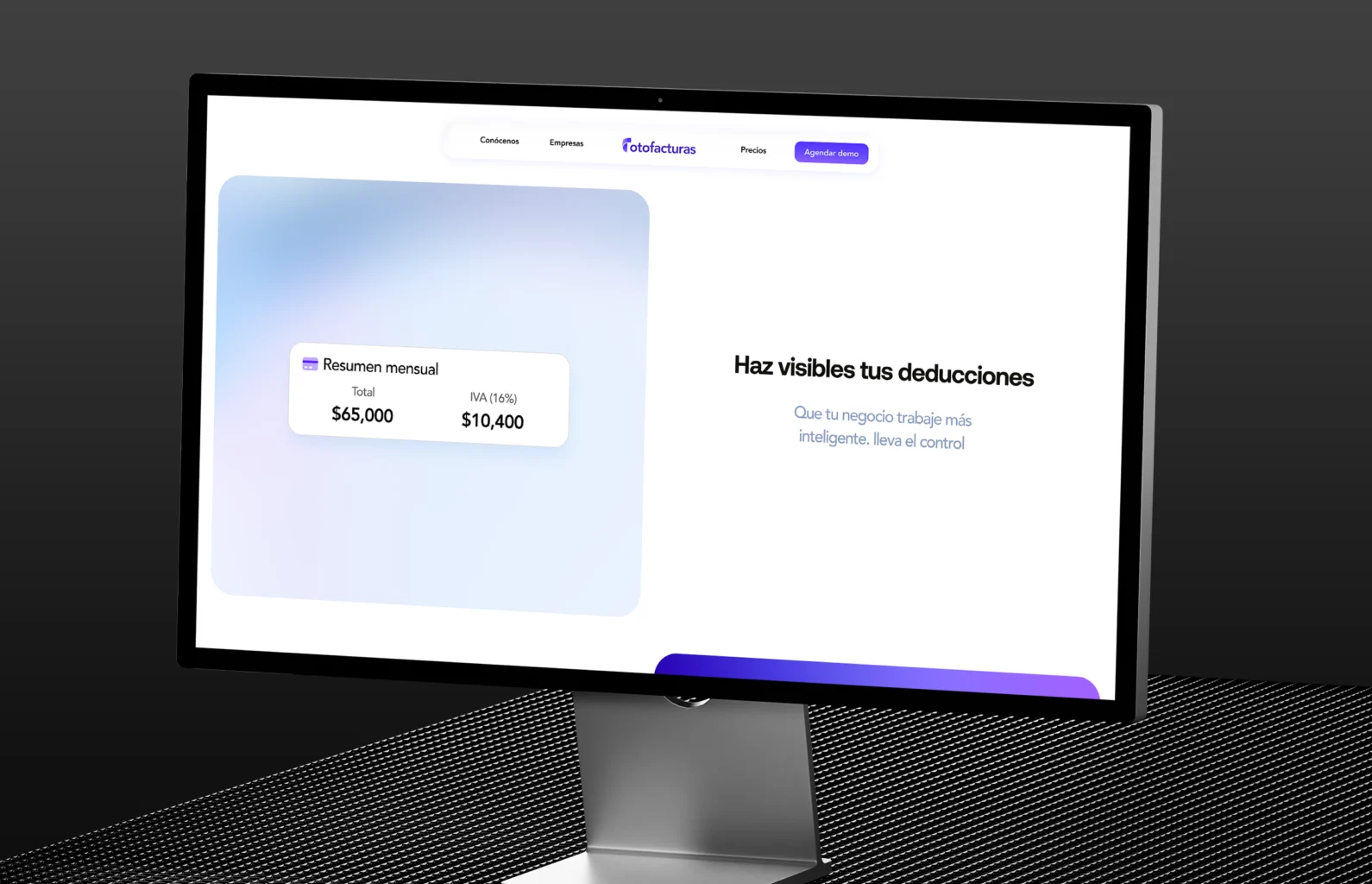
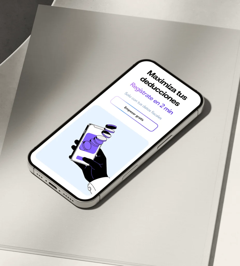
1. Transparency and Simplicity
Clean interfaces, clear typography, and a precise visual hierarchy to deliver immediate trust.
The goal was for everything to be understood without effort.
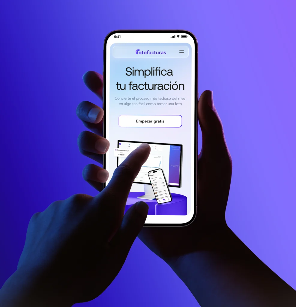
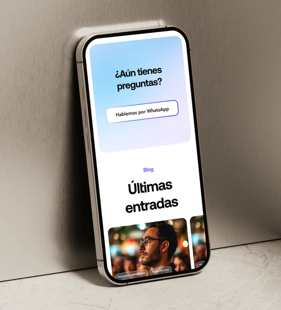
2. Interaction as Guidance
Microinteractions and subtle transitions that help orient the user and reinforce the product’s key actions (capturing a receipt, generating an invoice, managing their history).
3. An Accessible Tech Identity
The new visual language blends Fintech structure with a more human tone:
soft colors, clear iconography, and a modular system that allows the product to scale over time.
Details aren’t details.
They make the design
When systems grow complex
Clarity becomes the ultimate innovation
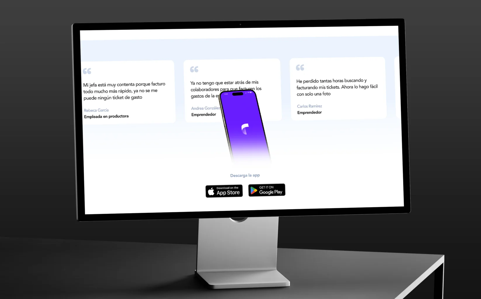
Rebuilding Trust Through Product-Driven Design
A heavy, confusing tax process is reframed into an experience that feels simple and human.
The visual story of Fotofacturas is redesigned to communicate trust from the very first scroll.
Content is organized as a clear path — from “I don’t get invoices” to “I’m ready to start.”
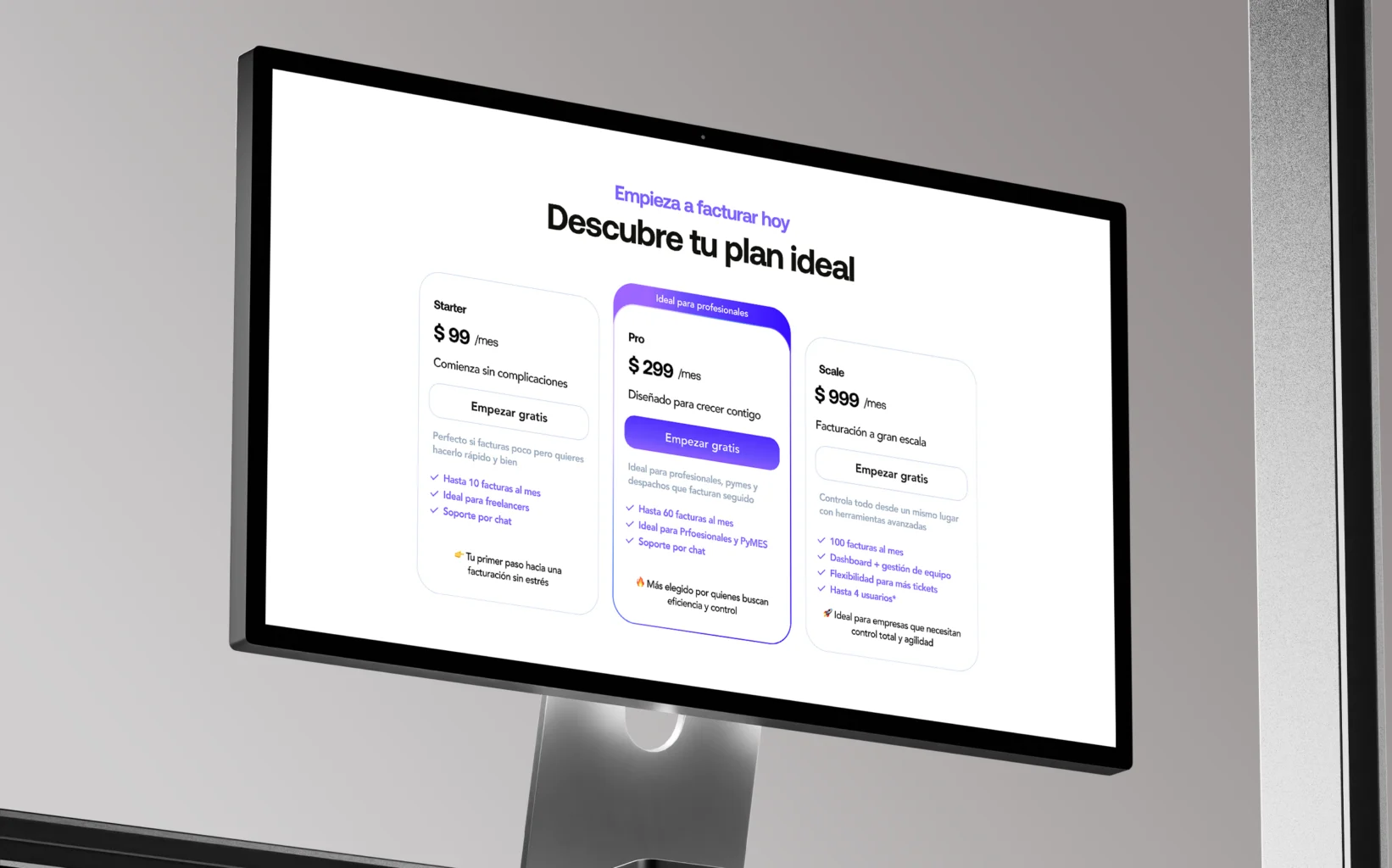
Numbers, plans, and features are translated into messages that speak the user’s language.
A visual system is built that stops feeling like a website… and starts behaving like a solid product.
User Personas and Challenges
Core User Archetypes


marketplace
Smart restocking for the corner store.
digital account
Your first step to smarter money
financial services
Simple money, same-day answers